Visualize Evidence Skillfully
Effective business communication relies heavily on visualization of evidence. Whether you are making a business presentation to a room of investors, writing an informal email in response to a request for data, or preparing a full-length business proposal for your top management team, conveying evidence in a visual way will help you be more effective.
Visualizations are effective for several reasons. First, visualizations are more concise than text. You can embed a lot of information in a simple visual that could otherwise take many paragraphs of words to communicate. Second, visuals are inherently appealing. The human eye is drawn toward images. Flip through any magazine, book, or brochure. The text on the pages starts to blur, but images grab your attention. Third, visuals can offer instant insights that text cannot reveal. With the right visualization, your receiver can, in a moment, identify trends over time, progress toward a benchmark, or key distributions.
Here, we cover several common visualization tools, their uses in business communication, and some tips for each.
Compile a Table
The purpose of a table is to highlight key facts and figures so that your receiver can draw a quick summary or make easy comparisons. You might use tables to summarize and compare product features within a category, district sales for the last fiscal year, or competing bids for a construction project. You can build a table by following the steps below.
Identify the Categories of Comparison
First, you must identify the information that is going to be necessary to make a decision. Categories can represent any piece of evidence that is common to all or most things you’ll be comparing. For example, if you were comparing vehicles for purchase, you might identify price, fuel efficiency, estimated cost of maintenance/repairs, estimated cost of insurance, customer ratings, and options (like Bluetooth, remote start, heated seats).
Create Rows and Columns
Next, create a row for each thing you’ll be comparing and create a column for each category (or vice versa, as sometimes tables fit better on a page with the columns/rows flipped). Next, fill out each cell. As you fill out cells, be as concise as possible. Where possible, use values instead of sentences. If you want to make a point that one option is better than the others, you might even color code certain cells to draw your receiver’s attention to those cells.
Order the Table Logically
Finally, order the table in a way that aligns with your receivers’ needs. For instance, assume you are creating a table that compares product category sales by state. If your receiver is the vice president of sales for the entire company, she likely will be most interested in what states are at the top and bottom of the list. In that case, you should order the table by amount of sales. But if your receivers are the state territory managers who will be reading a long report and looking for their own state’s data, then you might instead order them by state name so it is easier for the territory managers to find their own states.
Make a Chart
The purpose of charts is to provide at-a-glance summary data. You can choose from a wide variety of chart types.[1] Here, we cover three common ones. But before we delve into the nuances of the different kinds of charts, consider some overall advice for building good charts.
Select the Right Chart
First and foremost, it is important for you to select the right chart for what you are trying to communicate. There are several different kinds of charts that you can use. Here, we cover advice for the three most common types.
Pie Charts
Pie charts represent allocations of a whole. They can be used to show a distribution of budget expenditures or how much of your workday you spend on various tasks. Best practices for making pie charts include:
-
- Place segment of interest at top. This keeps your receiver’s attention focused on the most important slice.
- Label each segment with its category name and percentage. Direct labels are generally easier to read than using a legend.
- Avoid creating too many “slices” of pie. Pie charts get hard to read if they have more than 7 or 8 slices. Consolidate less important pieces into an “other” slice.
- Make sure all your slices add up to 100%. If they don’t, you’ve made a mistake somewhere.
Bar and Column Charts
Bar and column charts compare the value or measurement of items. What makes bar (horizontal) and column (vertical) charts different from pie charts is that each number is independent and together, the values do not necessarily add up to 100%. Bar charts can be used to show annual sales volume of different flavors of ice cream or how many alumni work at various local companies. Best practices for making bar charts include:
-
- Logically order your bars. You should strategically order the bars in a way that will make the most sense to your receiver, whether that is alphabetical, numerical (in ascending or descending order based on value), or some other method.
- Clearly indicate the units of measurement on the y-axis.
- If your receiver needs specific numbers or if you want to emphasize the values of the bars, label each bar. If your receiver needs only to understand the basic trend, then omit the labels
Line Charts
Line charts identify trends over time. Line charts can be used to show how social media engagement has increased over time or how stock prices have fluctuated over the past week or past decade. Best practices for making line charts include:
-
- Represent time on the horizontal axis, moving from left to right.
- Use no more than four lines on each chart.
- Differentiate the lines using different colors or line designs.
- Clearly label each line.
- Start the Y-axis at 0. If you start the axis at a higher number (called “truncating” the axis), it can misrepresent the trend you are showing.
Communication Tip: Which Chart Should You Use?
Choosing the right chart for your message can be challenging at times. This side-by-side comparison can help you visualize the options.
Pie Chart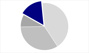 |
Bar/Column Chart |
Line Chart |
| Pie charts visualize allocations of a whole | Bar/column charts visualize values of segments | Line charts visualize values over time |
| Examples How much of a monthly budget is spent on rent Percentage of employees who identify as a particular race or ethnicity |
Examples Number of new accounts opened in each branch How many sick days were used in each department |
Examples How employee turnover has fluctuated in the past three years The number of errors made since the training program was implemented |
Add a Descriptive Title That Asserts Your Takeaway Point
The more complete you make your heading, the less room you leave for receivers to misinterpret your intention. For instance, you might want to retitle “Annual office expenses” (which is a topic) to something more descriptive like “Annual office expenses nearly doubled last year.”
Eliminate Chart Junk
Chart junk is anything that visually detracts from your central message.[2] This can include extra tick marks, grid lines, data markers, and 3-D effects that visually distract. It can also include redundant titles, legends, or data labels. With a chart, the simpler it is visually, the clearer it will be in communicating your intended message.
Use Color Strategically
Color plays an important role in how humans process information. If you use too many colors, your receiver may not know where to look. But if you make everything in your chart grey, except for the pie slice, bar, or line of primary interest that you make pop with a bright color, then your receiver will instantly know what is most important on your chart.
Check for Stand-Alone Sense
Your receiver should be able to read your chart and understand it without having to ask additional questions. Label every element properly, including units.
Generate a List
The purpose of a list is to provide inventory of some category in a concise and skimmable way. You might need to create lists of products, clients, employees, suppliers, tasks, etc. There are two key decisions to make when creating a list.
First, order the “members” in a logical way. The ideal ordering will depend on your purpose and how your receivers will likely process that list. Will they search the list for names? List them alphabetically. Must they complete these tasks in a particular order? List them chronologically.
Second, determine if you should number or bullet the list. Numbered lists usually connote some sort of rank or priority order. For instance, you might rank your top ten sales performers for the quarter. Bulleted lists suggest equally weighted items. For instance, if you list your clients on your website, you can make them feel equally important by putting them in a bulleted list.
Communication Tip: Keep It Parallel
Parallel structure is a technique for conveying your ideas more clearly. Parallel structure means that every item in a series is worded in a similar way to all the others. For example, if you are creating a list of accomplishments, every item could start with a past tense verb. If you are creating a list of distinguishing features of a new product, you might start each item of the list with an adjective.
Not Parallel
|
Parallel
|
Draw a Map
The purpose of maps is to visually represent a variable across geographic space. Maps can be used to show unemployment trends, cell phone service coverage, or store locations. And with new map-making technology, even a novice can create custom maps.
The most important thing to know about maps from a business communication standpoint is that making a good map begins by making higher-ordered decisions about your map. How much detail do you want to show? What details do your receivers need? For example, if you only need to know how many customers are in each state, you might use a low-detail map with darker shades indicating more members and lighter shades fewer members. But there may be other times when you need much more detail and will have to be able to pinpoint specifically where something is located.
Create an Infographic
The purpose of an infographic is to visually display evidence in an eye-catching way. This style of visualization has grown in popularity in recent years and typically involves very large font sizes, striking colors, and/or icons. You can use infographics to emphasize startling statistics or highlight interesting tidbits of information. Here are some best practices to keep in mind.
First, you should identify which pieces of evidence are best suited to be presented as an infographic. For instance, if you have a pie chart that shows 95% of customers would buy from the company again, that would probably be more impactful as an infographic. Second, just like charts, infographics should not be cluttered. So, use simple graphics and fonts. Finally, infographics should be substantive and helpful to your claims instead of functioning only as a “decoration” in the midst of boring text.
Your Turn: Which Data Visualization Would You Use?
Which data visualizations would you use for each of the following scenarios?
Showing the growth of regional coverage of your franchise locations over time
Demonstrating that employees are making too many photocopies
Showcasing the top 10 sales representatives from last quarter
Comparing cell phone plans
Celebrating a record year in sales
Providing a breakdown of customer service calls completed by employee
Questions to Ponder
1. Choose one of the scenarios above and draw two different visualizations. What are the strengths and weaknesses of each?
2. What visualizations are most appealing to you? Why?
- To identify a broader range of chart options, we recommend this book: Stephanie Evergreen, Effective Data Visualization: The Right Chart for the Right Data (Thousand Oaks, CA: SAGE, 2017), http://stephanieevergreen.com. The book includes both big-picture strategies and step-by-step instructions for creating charts in Microsoft Excel. ↵
- “Chart junk” is a term that was coined by Edward Tufte, who was one of the pioneers of data visualization. See Edward Tufte, Envisioning Information (Cheshire, CT: Graphics Press, 1990). ↵
using similar words, parts of speech, verb forms, or other elements to create cohesion
