6 Lab #6: Air Pressure and Winds
Lab #6
Zachary J. Suriano
Introduction and Objectives
Atmospheric pressure is the force exerted by the air, and it is proportionate to the mass of the air overhead. When there is High pressure there is more mass overhead and a greater force is applied. Conversely, when there is Low pressure there is less mass overhead and a lesser force is applied. A change in atmospheric pressure between locations, or pressure gradient, sets the atmosphere in motion yielding wind. In this lab, we will explore the various ways we plot pressure and pressure gradients, what else acts on the wind once it is in motion, and how we visualize wind conditions.
Specific learning objectives of this lab are to:
- Analyze surface pressure plots and station models.
- Calculate and visualize pressure gradients.
- Describe how the Coriolis Force influences the wind.
- Interpret information from Wind Charts and Wind Roses.
Surface Pressure
Station Models
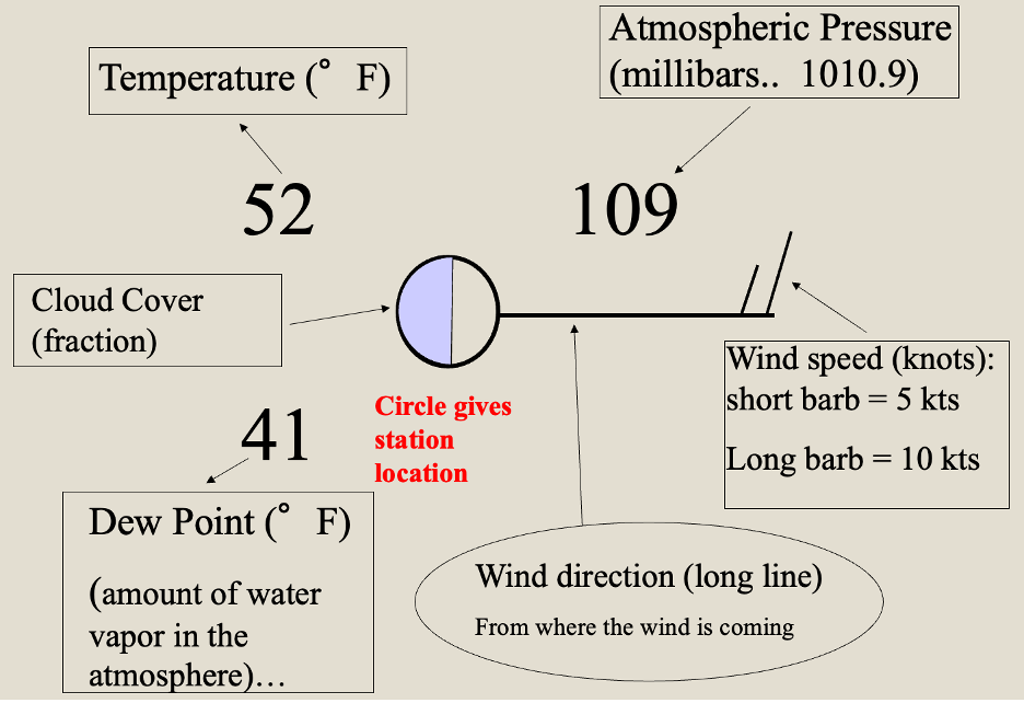
Surface pressure, the atmospheric pressure at the surface, is a regularly observed meteorological variable at weather stations across the world. While we have previously explored ways in which meteorological information is presented and visualized, here we will focus our efforts on the Station Model. The Station Model depicts a variety of weather conditions in a condensed manner, including temperature, dew point, wind speed and direction, pressure, cloud cover and precipitation conditions. Below you will see an example of a Station Model with the specific locations of the meteorological information labeled about the center circle (Figure 6-1).

Today, we will be focusing on the atmospheric pressure value, the 3-digit number in the top-right corner of the Station Model. In an effort to condense the information displayed, this 3-digit number is shorthand for the actual pressure value. To read the actual pressure value you need to:
- Divide the number by 10 (or alternatively place a decimal between the second and third digits)
- Add either 900 or 1000 to the result from (1). To decide which is correct (900 or 1000), there are the following guidelines:
- If the first digit is a 0, 1, 2, 3, 4, or 5: add 1000.
- If the first digit is a 6, 7, 8, or 9: add 900.
- Exceptions can exist during intense weather events (e.g., strong hurricane)
- Add units of millibars (mb) or hectopascals (hPa)
Some examples:
| Station Model Pressure Value | Actual Pressure Value |
| 887 | 988.7 mb |
| 015 | 1001.5 mb |
| 440 | 1044.0 mb |
| 638 | 963.8 mb |
Concept Check #1
Convert the following raw station model pressure values into the actual pressure value.
| Station Model Pressure Value | Actual Pressure Value |
| 915 | |
| 763 | |
| 392 | |
| 008 |
Pressure Plots
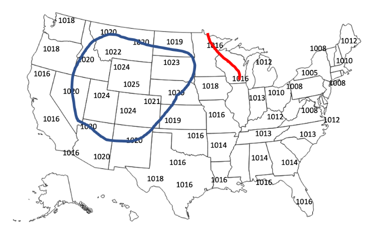
To quickly assess surface pressure over a region, meteorologists will plot the pressure value from the Station Model on a map. Similar to the plotting of isotherms from Lab #3, pressure plots include surface pressure values and isobars (lines of constant pressure). While not always the practice in real situations, in this exercise pressure values on pressure plots are in millibars (mb), are rounded to the nearest whole number for convenience, and are drawn at 4 mb intervals. Below is an example surface pressure plot with the 1020 mb isobar already drawn (in blue; Figure 6-2). Notice how the smoothed line connects the locations with pressure values of 1020 mb, and locations with higher pressure are all on one side of the line and areas with lower pressure are all on the other.

Concept Check #2
In the above figure (Figure 6-2), you will see the beginning of the 1016 mb isobar (in red). From its location in southern Wisconsin, where will the 1016 mb isobar line go next?
(a) East into Michigan
(b) Southwest into Missouri
(c) Southeast into Indiana
(d) West into northern Iowa
Pressure Gradients
As defined in the introduction, a pressure gradient is a change in pressure over a distance. Similar to how a very steep hill is a large change in elevation over a short distance, a large change in pressure over a short the distance is a large pressure gradient. By that same logic, a flat area has a small (or no) change in elevation over a certain distance and a small (or no) change in pressure over a distance is a small pressure gradient. We mathematically represent the pressure gradient as:
Pressure Gradient = ( change in pressure / distance )
For example, from Louisville, KY to Bowling Green, KY is approximately 150 km. The pressure in Louisville is 1014 mb and the pressure in Bowling Green is 1009 mb. The pressure gradient over this distance would be:
Pressure Gradient = ( pressure in Louisville – pressure in Bowling Green ) / ( distance between Louisville and Bowling Green )
Pressure Gradient = ( 1014 mb – 1009 mb ) / 150 km
Pressure Gradient = 0.033 mb/km
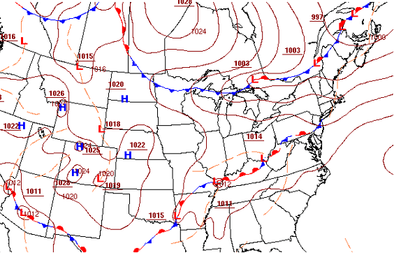
In the atmosphere, the strength of the pressure gradient helps determine the wind speed. Stronger pressure gradients yield faster winds, and weaker pressure gradients yield slower winds. The pressure gradient force is always directed from higher pressure towards lower pressure, and winds will move generally from higher pressure towards lower pressure. On a pressure plot, larger pressure gradients (and thus faster winds) occur when the isobars are closer together, while when the isobars are spaced apart, the pressure gradient is smaller and slower wind speeds.
Concept Check #3
Based on the pressure plot below (figure 6-3), which location has a larger pressure gradient?
(a) Georgia
(b) South Dakota
(c) New York
(d) Kentucky

The Coriolis Force
Once the atmosphere is in motion from the pressure gradient force, other forces begin to act on the air. Friction works opposite of direction of motion and slows the wind. At the surface, friction is an important force, but as you move up away from the surface it becomes less and less impactful. The third primary force that acts on horizontal motions of air is the Coriolis Force. The Coriolis Force causes the wind to curve, or deflect, from the direction of motion. In the Northern Hemisphere, the Coriolis Force causes the wind to curve to the right of the direction of motion. In the Southern Hemisphere, the Coriolis Force causes the wind to curve to the left of the direction of motion. This curving of the wind from our perspective is a result of Earth’s rotation. The Coriolis Force is greatest at the pole, and is zero at the Equator. Additionally, the faster the wind is moving, the greater the Coriolis Force and thus the greater the curving of the wind.
There are many different visualizations of the Coriolis Effect online that could be referenced with a quick internet search. One video that does a reasonable job visualizing this effect can be found at the following link: https://www.youtube.com/watch?v=mPsLanVS1Q8
Wind Charts and Wind Roses
Combining the Pressure Gradient Force, the Frictional Force, and the Coriolis Force, we get our final wind speed and wind direction. In the Northern Hemisphere, winds move clockwise away from High Pressure and move counterclockwise in towards Low Pressure. The opposite occurs in the Southern Hemisphere, where winds move counterclockwise away from High Pressure and move clockwise in towards Low Pressure. Recall, the closer the isobars the greater the pressure gradient and thus the faster the wind speed.
We visualize winds a number of different ways in meteorology. First is through the Station Model. The direction of the wind is indicated by which way the wind barb, or staff, extends away from the station. Winds are named from where they come from. The speed of the wind is represented by the notches, or flags, drawn on the end of the directional barb. A long notch is equal to 10 knots, a short notch is equal to 5 knots, and a shaded triangle notch is equal to 50 knots. To find the wind speed, you add up all of the notches. An example is below (Figure 6-4).

Assuming up the page is north, note how the directional barb extends to the east. This means the wind is an easterly wind (moving from east to west). There are two long notches and one short notch, meaning the wind speed is 25 knots (10 + 10 + 5 = 25).
Concept Check #4
What is the wind speed and direction of the following station model locations? Provide your wind direction in general terms (e.g., NW, ESE, W, etc.) not degrees.

Wind Charts
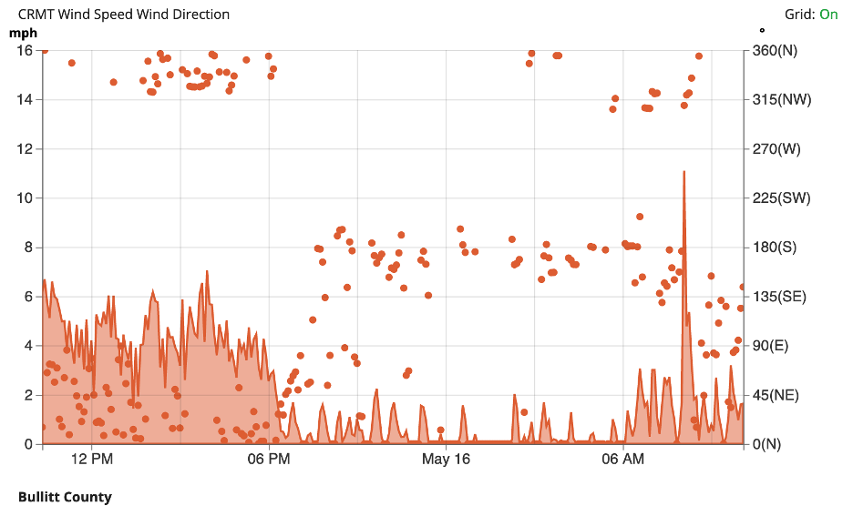
A second way we visualize winds are through a wind chart. These are typically for a single location over a set period of time, such as a day or 72 hours. The X-axis shows time, typically with the most recent time period to the right and older times to the left. Then on the left side of the Y-axis there is the wind speed and the right side of the Y-axis is the wind direction. For each time, a line graph represents the wind speed and a dot represents the wind direction. Below is an example from the KY Mesonet in Bullitt County from mid-May (Figure 6-6).

We can see that at 6pm on May 15th, the wind speed was approximately 2.5 mph and the wind direction was N or NNW.
Wind Roses
When representing wind conditions over longer time periods, such as a 30-year climatology, meteorologists use Wind Roses. Wind roses plot the frequency of wind speeds and directions for a specific location on a modified pie chart. Each primary wind direction (N, NNE, NE, ENE, E, etc.) are visualized with a “petal”. The length of each “petal” is proportional to the percentage of time the wind blows from that direction. The further the petal extends from the center the more of the time the wind blows from that direction. Embedded within this information are also color-coded scalers of wind speed within each petal. The relative thickness of a particular color within a petal indicates the amount of time the wind is from that direction and at speed. For example, we see the wind rose for Bowling Green, KY from 1991-2020 below (Figure 6-7).

The petal that extends furthest from the center (indicating the most common wind direction) is S, corresponding to just over 10% of the time. The second most common direction is SSW, at approximately 7% of the time. The least common wind direction is that of SE, that occurs just 2% of the time. Additionally, note how in the center of the wind rose is the “calm” designation of 25.7%.
Concept Check #5
Using the Wind Rose from Upstate New York (Figure 6-8), answer the following questions. Use standard wind directions (e.g. S, SSE, SE, etc.). Where appropriate, round answers to the nearest whole number.
(a) What is the most frequent (or prevailing) wind direction?
(b) What is the least frequent wind direction?
(c) What percentage of time (rounded to the nearest whole number) is the wind from the South?
(d) What percentage of time (rounded to the nearest whole number) is the wind from the NE?
