3 Chapter 3 Elements and Principles
Overview
Digital artists, designers, and digital media producers use similar elements and principles to guide them to create effective visual communication. Based on literature reviews, there are different elements and principles of art and design as shown in Figure 1. They also use similar computer systems and design software, a tablet for hand drawings, a digital camera or a mobile phone to take digital photos, and a camcorder or mobile phone to capture moving images or videos even though they employ different design processes and approaches. In the digital age, digital artists, designers, and creative practitioners use contemporary software to create artwork for digital printing and distribution.
Figure 1 Elements and Principles
Source: Created by Siriporn Peters 2024.
Elements and Principles of Art
There are 7 elements of art that digital artists use to create visual communication and design elements.
1) points or dots,
2) lines,
3) shapes,
4) forms,
5) space,
6) color, and
7) Texture.
Digital artists use principles of art as tools to guide them to create effective visual communication. The key principles of digital art consist of
1) unity and variety,
2) focal point and emphasis,
3) balance and rhythm,
4) scale and proportion (Fichner-Rathus, L. (2011).
Elements and Principles of Design
In the design practice, there are 3 design elements: Texts, Images, and Colors. Both digital and physical design focus on communication as their function. It is created to provide vital information or convey a message. For example, roadway signs in the United States increasingly use symbols rather than words to convey their message as shown in Figure 2.
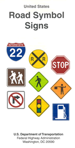
Figure 2 U.S. Road symbol signs
Source: U.S. Department of Transportation, Federal Highway Administration
The color of roadway signs is an important indicator of the information they contain. The use of red signs is limited to stop, yield, and prohibition signs. A white background indicates a regulatory sign; yellow conveys a general warning message; green shows permitted traffic movements or directional guidance; fluorescent yellow/green indicates pedestrian crossings and school zones; orange is used for warning and guidance in roadway work zones; coral is used for incident management signs; blue indicates road user services, tourist information, and evacuation routes; and brown is for guidance to sites of public recreation or cultural interest.
Sign shape can also alert roadway users to the type of information displayed on a sign. Traffic regulations are conveyed in signs that are rectangular with a longer direction vertical or square. Additional regulatory signs are octagons for stop and inverted triangles for yield. Diamond-shaped signs signify warnings. Rectangular signs with a longer direction horizontal provide guidance information. Pentagons indicate school zones. A circular sign warns of a railroad crossing. The shape and color of a sign indicate the nature of the message as shown in Figure 3.
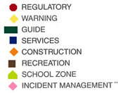
Figure 3 U.S. Sign shapes and colors.
Source: U.S. Department of Transportation, Federal Highway Administration
In 1974, Symbol Signs: AIGA (American Institute of Graphic Arts) and the U.S. Department of Transportation were created by Roger Cook and Don Shanosky. A first set of 34 symbols was published in 1974, and received one of the first Presidential Design Awards; 16 more symbols were added in 1979. These copyright-free symbols have become the standard for off-the-shelf symbols in the catalogs of U.S. sign companies as shown in Figure 4. They are now available on the web for the first time.
Figure 4 Symbol Sign, designed by Roger Cook and Don Shanosky in 1974.
Source: Symbol Signs: AIGA (American Institute of Graphic Arts) and the U.S. Department of Transportation
The key design elements consist of texts, images, and colors. In graphic design, texts or types have language barriers even though more and more people can read and write in English languages. Images are more inclusive and accessible for all people. Therefore, images are virtual for visual communication design as well as graphic design like symbol signs, designed by Roger Cook and Don Shanosky in 1974. Colors are also essential for communicating key information like the U.S. Sign shapes and colors. Graphic designers can combine these 3 elements to create a combination mark like “Shark Energy Drink” Trademark as shown below.
Figure Combination Mark
Source: https://sharkenergy.com/
Design Principles
Graphic design principles are tools to guide graphic designers to create effective graphic designs.
1. Balance
Balance is the distribution of the visual weight of objects, colors, texture, and space. If the design was a scale, these elements should be balanced to make a design feel stable. In symmetrical balance, the elements used on one side of the design are similar to those on the other side; in asymmetrical balance, the sides are different but still look balanced. In radial balance, the elements are arranged around a central point and may be similar (Getty Museum)
2. Contrast
Contrast refers to opposite aesthetic qualities in any design element or component present in visual communication. Contrast is used to create emphasis, focal point, visual tension, separate parts, interests, and assists with building hierarchy according to the Victorian Curriculum and Assessment Authority.
3. Hierarchy
Hierarchy refers to the ‘reading order’ of a design. Creating a reading order enables a designer to first attract a viewer’s attention and then communicate ideas and information in a progressively diminishing manner. Hierarchy is created by design elements or other design principles. Factors determining hierarchy may be the scale, contrast, color or the positioning of the visual components. Examples of applications include print media layouts such as posters, newspapers and magazines, website layouts, book covers, and posters. Environmental and industrial designers will also create the hierarchy with elements and principles including form, contrast, position, and scale according to the Victorian Curriculum and Assessment Authority.
4. Scale
Scale refers to the relative size of two or more components in a visual communication. These may be similar but different components, including shapes, forms, images and/or type. Variation in size between two or more components of the same kind is used to create depth in compositions. Scale is used to create a hierarchy. The scale may also be expressed as a ratio when discussing or producing maps, diagrams, illustrations, technical drawings, models, or mock-ups.
5. Cropping
Cropping refers to the cutting, framing or masking of a component of a visual communication. The component is often oversized and therefore trimmed by a layout module, margins or the edge of the format. Cropping is a compositional technique related to ‘open’ and ‘closed’ composition and was influenced by the advent of photography in the mid-19th century. The two main purposes of cropping are to create impact by showing a component larger than possible in scale and to imply that a component extends beyond the field of the format.
The Gestalt Principles are principles/laws of human perception that describe how humans group similar elements, recognize patterns, and simplify complex images when we perceive objects. Designers use the principles to organize content on pages, websites, and other interfaces so it is aesthetically pleasing and easy to understand. In the 1930s and 1940s Gestalt psychology was applied to visual perception, most notably by Max Wertheimer, Wolfgang Köhler, and Kurt Koffka who founded the so-called Gestalt approaches to form perception. (Interaction Design Organization).
The law of proximity posits that when we perceive a collection of objects, we will see objects close to each other as forming a group (Interaction Design Organization). Proximity helps create organization in a design since similar or related elements should be grouped to create a relationship between them. Ideally, you cluster the elements together in a way that helps to declutter the overall design and supports the comprehension of the information according to Adobe.
The law of similarity captures the idea that elements will be grouped perceptually if they are similar to each other.
The law of symmetry captures the idea that when we perceive objects we tend to perceive them as symmetrical shapes that form around their centre. Most objects can be divided in two more or less symmetrical halves and when for example we see two unconnected elements that are symmetrical, we unconsciously integrate them into one coherent object (or percept).
The law of closure posits that we perceptually close up, or complete, objects that are not, in fact, complete.
The continuity principle of Gestalt states that we group elements that seem to follow a continuous path in a particular direction. The human eye follows the paths, lines, and curves of a design and prefers to see a continuous flow of visual elements rather than separated objects. The human eye continues to follow the path even if an obstacle hides it or its flow is “broken” by interlinking or bisecting visual elements (Interaction Design Organization)
Figure and ground work together to establish the importance of visual information within a picture plane. ‘Figure’ refers to components that are more visually dominant than the ground on which they are placed. A figure may also be known as ‘positive space’ or ‘form’. The ground can be known as ‘background’, ‘negative space’, or ‘counter form’ according to the Victorian Curriculum and Assessment Authority.
To have a better understanding of these elements and principles, students can learn to apply these principles through practice.
Elements and Principles of Digital Media
There are 4 key elements of digital media as follows.
1. Still images or photos, which are also known as Raster Images or Bitmap images (RGB color mode, 72 ppi)
2. Moving images such as videos, motion graphics, and animation film (.mov, .mp4)
3. Audio, music, sound effects, or voiceover or narrative audio (.mp3)
4. Still texts such as close captions and moving texts, which are also known as Kinetic typography. It is an animation technique that integrates motion with text, which is why it’s also sometimes known as motion typography.
Animation is a filmmaking technique by which “still images” are manipulated to create moving images. The animation can be created by hands and digital tools.
Motion Graphics are ‘graphics with movement’. The emergence of the technique in the mid-20th century transformed the discipline of graphic design, which until then had centered on static graphics.
Kinetic typography is an animation technique that uses moving text to capture attention, set a tone, and entertain.
The principles of Digital Media are
- Stay true to journalistic principles of telling the truth.
- Know your audience.
- Conciseness is key.
- Review it again and again.
According to Interaction Design Organization, visual hierarchy refers to the arrangement or organization of elements within a design in a way that guides the viewer’s eye through the content in a specific order of importance.
“Visual hierarchy controls the delivery of the experience. If you have a hard time figuring out where to look on a page, it’s more than likely that its layout is missing a clear visual hierarchy.”
– The Nielsen Norman Group
Based on literature reviews, there are different principles of design as shown below. Graphic designers can combine multiple principles to create effective visual communication design.
In creative practice, digital artists, digital designers, and digital media producers apply these elements and principles in their practice. As digital tools and technology for digital art, design, and media have rapidly been developed, digital artists, designers, and digital media producers will need to continue learning and improving to meet the requirements of their future jobs.
Inclusive and accessible design has become the best practice in this field. Digital art, design, and digital media have included audio sounds, physical texture as tactile graphics and braille, still images, and moving images in creative work. Audio, sound, and music have been included in the digital art and design to enhance visual communication and make digital art and design accessible for all. Subtitle or closed captions are added to enable people with hard hearing to perceive information and enjoy arts and design. 2D graphics, physical textures, tactile graphics and braille, and 3D shapes are created to enable people with low vision or visual disabilities.
Further Readings:
Burrough, X. (2014). Foundations of Digital Art and Design with the Adobe Creative Cloud. Pearson Education.
Burrough, X. and Mandiberg, M. (2008). Digital foundations: intro to media design with the Adobe Creative Suite. Peachpit Press.
Davis, J. (2016). Foundations of design. Tempe Digital.
Fichner-Rathus, L. (2011). Foundations of art and design: An enhanced media edition. Cengage Learning.
Lewis, R., & Luciana, J. (2020). Digital Media Foundations: An Introduction for Artists and Designers. Routledge.
Pipes, A. (2003). Foundations of art and design. Laurence King Publishing.